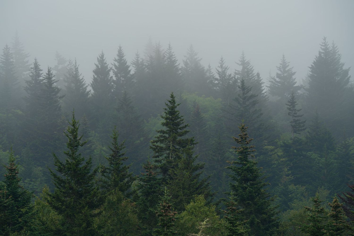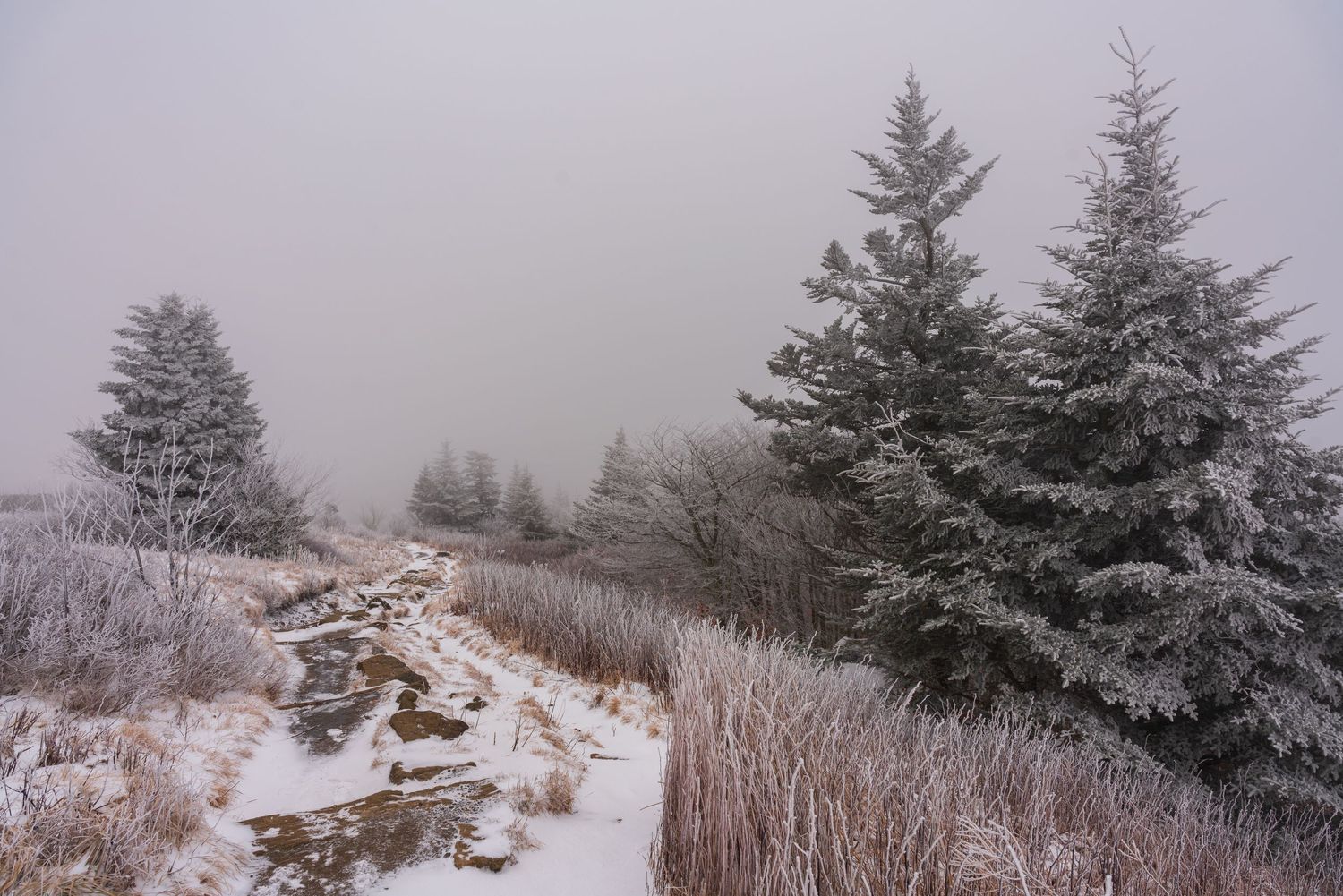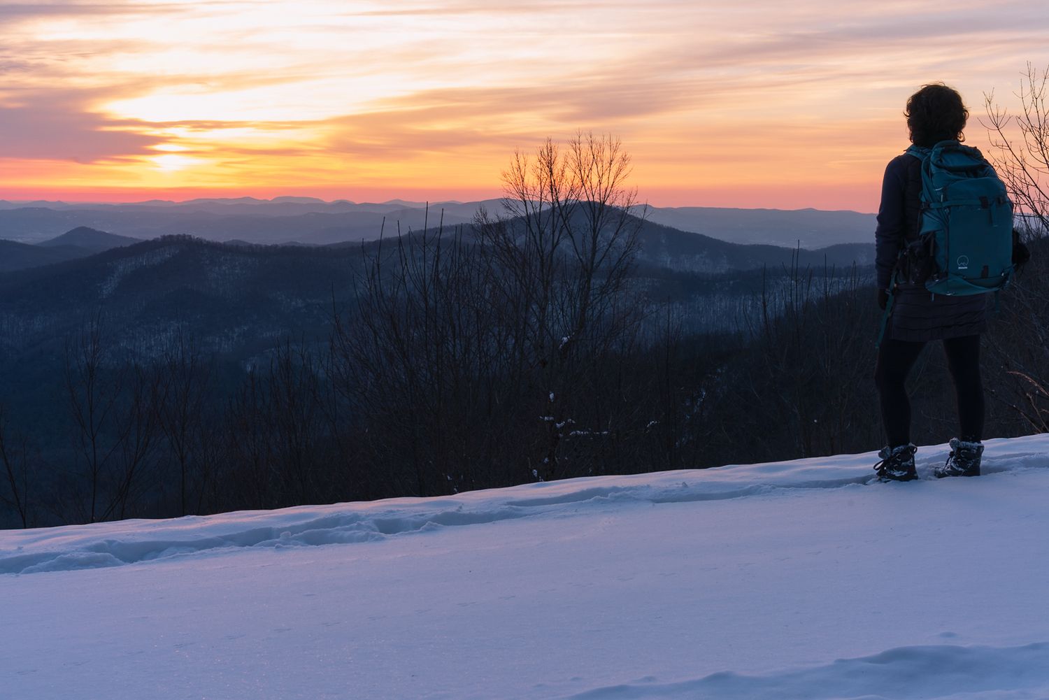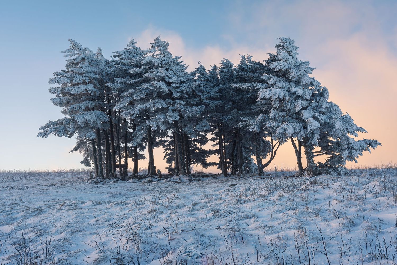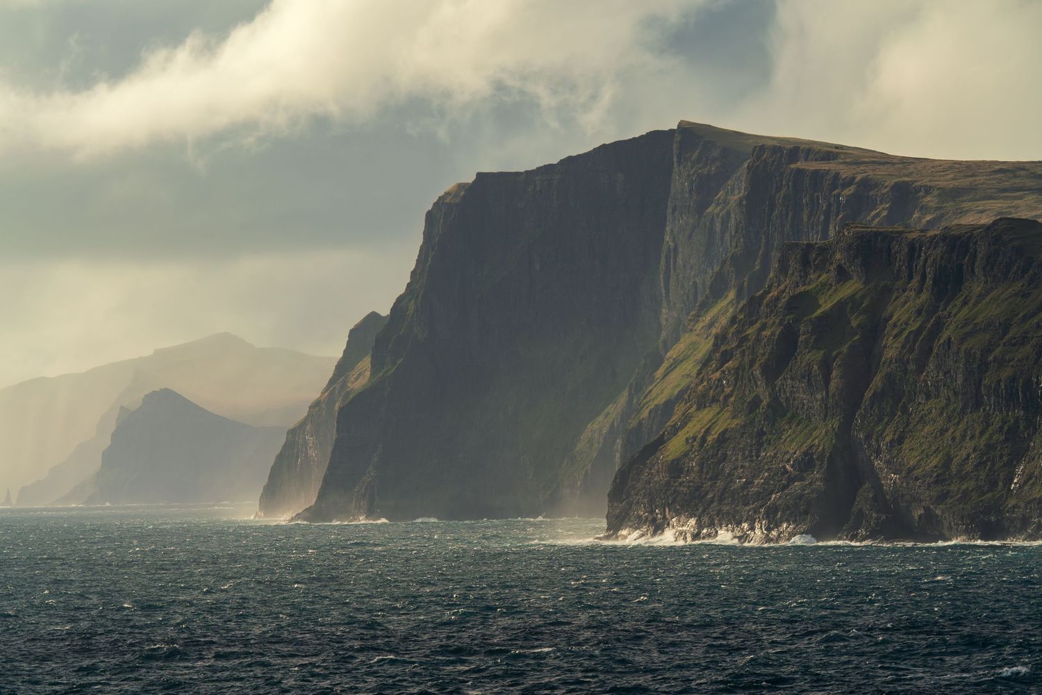
The photos that make it to print are almost never the ones I predict. Every year a small stack stops me on the first pass, before I've touched a single slider. Not because they're technically flawless. Because something in them briefly takes my breath away. That moment is the whole test, and it's the thing I've spent years learning to trust. So this is the honest breakdown of what makes a great landscape print: what I actually look for, what gets cut without a second thought, and how a file travels from the back of my camera to something worth hanging on a wall for the next thirty years. It's the strictest editing I do, and I do it with intention.
Why the print edit is the strictest edit I do
A photo on a screen gets a few seconds of a stranger's attention, backlit and scrolling past. A print gets years. It hangs in a hallway someone walks through every morning, in the light of a living room, at the size of an actual window. That permanence changes the standard completely.
On a phone, a lot of images look good. Small, bright, forgiving. Blow that same file up to fifty inches and the truth comes out. A weak foreground turns to mush. Noise in the shadows that nobody noticed becomes a texture you can't unsee. The picture that felt like a favorite in the feed can fall apart on the wall, and the quiet frame you almost skipped can hold the room. So I judge print candidates by one question. Will this still be worth looking at in five years, at full size, in good light? Most images say no. The ones that say yes are the whole point.
The hardest part isn't technical. It's refusing to let the memory of being there cast a vote. I know exactly what a place felt like at 5 a.m. when the light finally broke, and that feeling wants to promote the photo whether or not the frame earned it. A long conversation with Paul Zizka, a photographer I deeply respect, sharpened this for me. The only honest question is what the viewer sees, not what I felt standing there. The person who hangs the print wasn't on the mountain with me. The image has to carry the whole thing on its own.
What I look for when I choose an image to print
The criteria are consistent, even when the images aren't. Here's what I'm actually checking, more or less in this order, on that first pass:
- Composition that moves the eye. A clear way into the frame, usually through the foreground, and a path that carries the viewer from front to back without stalling. At print size, the eye can walk right into the picture, so a foreground has to earn that enlargement. Beautiful light on an unresolved composition is still an unresolved composition.
- Light that holds at scale. The quality of light is the first thing I read and the last thing I'll compromise on. Soft, directional, honest light survives enlargement. Flat or muddy light only gets flatter the bigger it goes.
- Tonal range that stays alive at the extremes. Detail in the deep shadows, detail in the bright highlights, and a full ladder of tones between them. A great print has somewhere to breathe at both ends.
- A clean frame. No stray branch at an odd angle, no glare spot, no bright patch pulling the eye where it shouldn't go. The small distractions I'd never catch on a phone become permanent at wall size, so I hunt them at the selection stage, not after I've fallen for the image.
- Something beyond the obvious frame. A place can be gorgeous and photographed a thousand times over. Iceland, Lofoten, the blue ridges of home. For a print to earn permanence, it has to offer a perspective or a set of conditions a viewer hasn't already seen a hundred times. The storm clearing, the fog sitting in the valley at exactly the right moment, the angle that isn't the one everyone shoots from the pullout.
Underneath all of it is the quiet test. Some frames simply stop me, and after years of choosing, that involuntary pause has been a more reliable editor than any checklist I've written. But the pause has to survive the trip to a stranger. If the only thing holding an image up is my memory of the morning, it's a personal keep, not a print. The feeling has to live in the frame, where someone who wasn't there can find it too.
The screen and the wall ask for different things
Here's the part people don't expect. An image that's finished for Instagram usually isn't finished for the wall, and the reason is physics, not taste.
A screen makes its own light. It throws brightness and saturation right into your eye, which is why a slightly over-punched edit can look great online. A print doesn't make light. It reflects the light already in the room, and that changes how contrast, color, and detail read. An edit that sings on a glowing screen can go dark or heavy on paper, with shadows that block up and lose everything I worked to keep.
So my print edits tend to run a little more open in the shadows and a little more restrained in the color than my screen versions. I'm editing for reflected light, for the specific surface the image will live on, and for the size it'll be seen at. The goal isn't a punchier picture. It's a picture that still looks like the moment when it's hanging across a room.
Why I print on metal and metallic
Most fine-art advice pushes you toward matte cotton rag, and it's beautiful for the right image. It isn't where my work lives. I reach for metal and metallic surfaces, and it's a deliberate choice about light.
My landscapes are built on light. Snow catching the last of the sun, water holding a reflection, the glow of a sky doing something rare. Metal prints and metallic paper give that light somewhere to go. The image is infused into the surface rather than sitting on top of it, so highlights read as luminous instead of flat, and there's a depth and a slight glow that a matte sheet can't reproduce. Color stays vivid. Blacks stay rich. The whole frame feels lit from within, which is exactly what the scene felt like when I made it.
There are practical reasons too. Metal is durable, resistant to moisture and fading, and it doesn't need glass, so there's no glare fighting the image on the wall. For work that's about light in the first place, it's the surface that tells the truth.
From the file to a finished print
I don't print in-house. I work with a professional lab, and choosing the right one is part of the craft, not a shortcut around it.
Once an image survives the selection edit, the mechanics matter more than people think. I export a high-resolution file in the color space and settings my lab specifies, because a beautiful edit sent in the wrong profile comes back looking unrecognizable. I match the material to the image, metal or metallic depending on where the image will live. And before I commit to a large size, I look at a proof. A test print at a smaller scale tells me what the screen never could: whether the shadows hold, whether the color is true to the day, whether the light does on the wall what it did in the field. Only then does it earn a spot in the shop.
None of this is complicated. It's careful. The difference between a good file and a great print lives entirely in the care.
Frequently asked questions
Q: How do you choose which photos to print?
A: I run every candidate through a few gates: composition that moves the eye through the frame, light that holds up at scale, a full tonal range with detail surviving in both the shadows and the highlights, a clean frame free of distractions, and a perspective or conditions that offer something beyond the obvious shot. Then the honest gut check. Does the image stop me, and does that feeling survive to someone who wasn't there? Print selection is the strictest edit I do, because a print has to earn years on a wall, not seconds in a feed.
Q: What's the best surface for landscape prints?
A: It depends on the image, and I won't pretend there's one right answer. For my work, which is built on light, I reach for metal and metallic surfaces. They give highlights a luminous depth, hold color and contrast beautifully, and need no glass, so there's no glare. Matte cotton rag is gorgeous for softer, painterly images. The surface should match how the light behaves in the frame.
Q: Why do my photos look different when they're printed?
A: Because a screen makes its own light and a print reflects the light in the room. A glowing screen can hide an edit that's too dark or too saturated, and that same file can come back heavy or muddy on paper. Editing for print means opening the shadows a little, easing the color, and proofing on the actual surface before you commit to a large size.
The last word
I still can't fully explain the frames that stop me. Some images elicit an involuntary gasp, and after years of choosing what goes on the wall, that gasp has never once steered me wrong. A great landscape print isn't the loudest photo I made that year. It's the truest one, prepared with enough care to last. If you've got a wall that's been waiting for something real, my current work is in the print shop.